Premos BarberSpa Website Build
In the world of web design, sometimes, less is truly more.
When approached by a bustling barbershop looking to revamp its online presence, our team embarked on a thrilling journey to create a sleek, minimalistic website that would not only reflect the shop’s friendly aesthetic but also ensure a swift and stylish online experience for its clients.
To add an extra layer of intrigue, we incorporated subtle animations that elevated the design to a whole new level.
Our first step in this digital makeover was to embrace minimalism, a design philosophy that champions simplicity and elegance. A minimalistic design is all about focusing on essential elements and eliminating clutter. For a barbershop, this meant using clean lines, a limited color palette, and a crisp, straightforward layout that showcased the services and provided a seamless user experience.
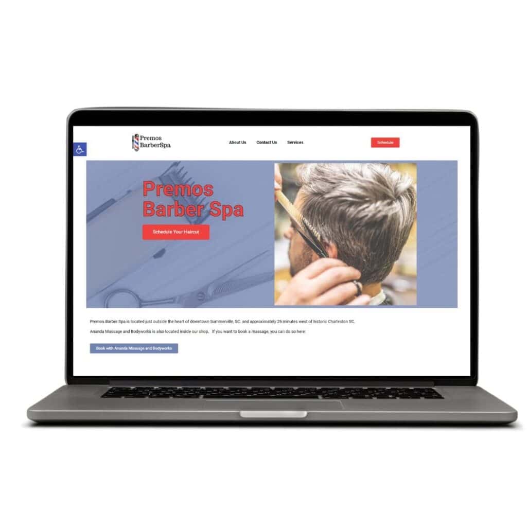
The Power of Visuals: Stock Photos and Business Originals
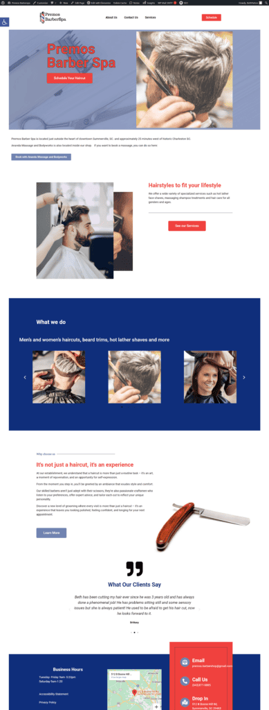
A critical component of our design strategy was the use of imagery. We carefully curated a selection of stock photos that resonated with the barbershop’s vibe and clientele. These photos, sourced from high-quality image libraries, added a touch of professionalism and visual appeal to the website.
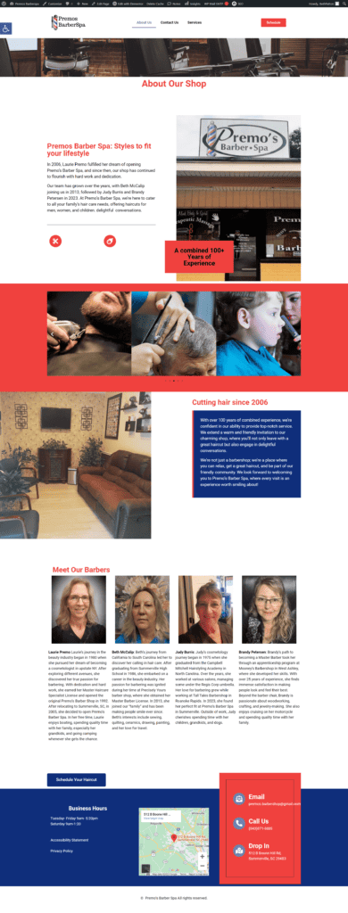
However, we also understood the importance of personalization. To make the website feel authentically ‘them,’ we incorporated some photos provided by the business itself. These included snapshots of the barbers at work, the shop’s interior, and happy customers enjoying their fresh haircuts.
By combining stock photos with genuine images and incorporating tasteful animations, we struck a harmonious balance between the polished and the personal while adding an extra layer of interest to the design. The result was a website that exuded professionalism and captivated visitors, making it not only a cut above the rest but also a memorable online destination.
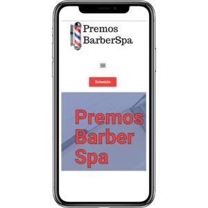
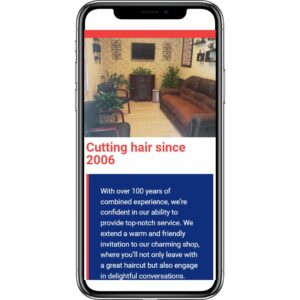
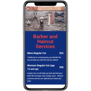
How do these web pages look on mobile?
Take a peek at the desktop view
Homepage
About Page
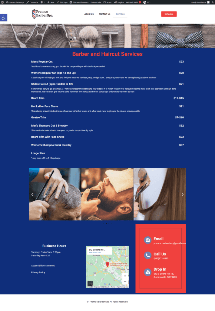
Service Page
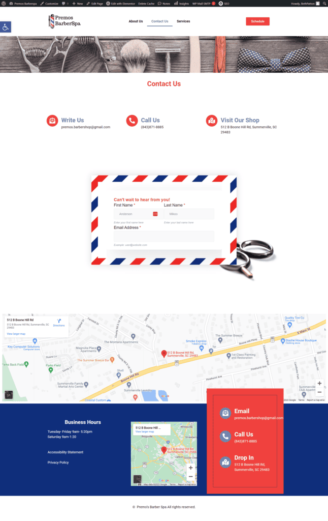
Contact Page
