Scales and Snuggles Visual Branding Project
This project is a concept piece that I dreamed of with a friend. We thought specialized reptile sitting would be a much needed service.
Then, my graphic designer and I got to work to create the branding elements.
Color Palette

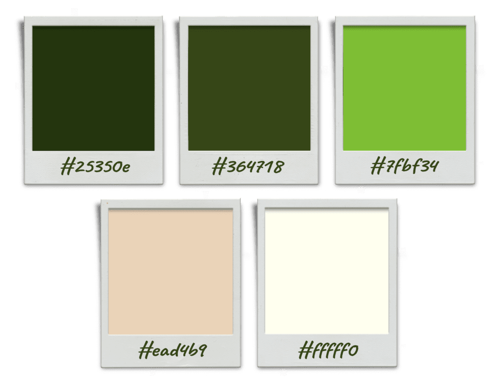
The brand colors for Scales and Snuggles were meticulously chosen to create an inviting and professional aesthetic that resonates with both reptile enthusiasts and pet owners.
The primary colors, dark green (#25350e) and bright green (#7fbf34), were selected to evoke the natural habitats where reptiles thrive. These shades of green convey a sense of nature, growth, and vitality, making them perfect for a business centered around the care of these unique pets.
To complement the primary greens, additional colors were chosen to enhance the overall visual appeal of the brand. Forest green (#364718) adds depth and richness, further emphasizing the connection to natural environments.
The cream (#FFFF0) and warm beige (#ead4B9) bring a sense of warmth and friendliness, softening the palette and making the brand feel approachable and welcoming. These neutral tones balance the vivid greens, creating a harmonious and inviting atmosphere.
Overall, the chosen color palette for Scales and Snuggles effectively conveys the brand’s commitment to providing a warm, friendly, and professional service while reflecting the natural environments that reptiles call home.
This thoughtful combination of colors ensures a visually appealing and cohesive brand identity that resonates with the target audience.
Font Choices

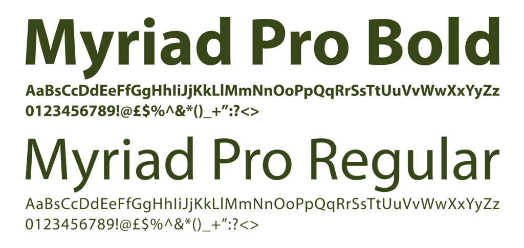
Choosing Myriad Pro Bold and Myriad Pro Regular as the font choices for Scales and Snuggles enhances the brand’s visual identity in several key ways:
Versatility and Readability
Myriad Pro is a versatile typeface known for its clean and modern appearance. The regular weight of Myriad Pro ensures that text remains highly readable and approachable, which is essential for a friendly and inviting brand like Scales and Snuggles. The clean lines and balanced proportions of Myriad Pro Regular make it ideal for body text, ensuring that information is easy to read across various devices and screen sizes.
Bold for Emphasis and Hierarchy
Myriad Pro Bold adds emphasis and helps create a clear visual hierarchy on the website and other branding materials. By using Myriad Pro Bold for headings, subheadings, and calls to action, important information stands out to the viewer. This differentiation guides users through the content seamlessly, ensuring they can quickly locate key information, such as services offered or contact details.
Professional Yet Friendly Aesthetic
The Myriad Pro typeface strikes a perfect balance between professionalism and friendliness. Its modern design lends a professional look, which is crucial for establishing credibility and trust with clients. At the same time, Myriad Pro’s rounded forms and open letter shapes convey a sense of approachability and warmth, aligning well with the friendly and caring nature of the Scales and Snuggles brand.
Consistency and Cohesion
Using both Myriad Pro Regular and Myriad Pro Bold ensures consistency across all branding materials. This consistency helps create a cohesive visual identity, making the brand instantly recognizable. Whether on the website, business cards, or promotional materials, the uniform use of Myriad Pro strengthens brand recognition and reinforces the professional yet friendly image.
Versatility Across Media
Myriad Pro is also highly adaptable, performing well in both print and digital formats. This versatility ensures that the Scales and Snuggles brand maintains a consistent and polished look across various media, from the website and social media graphics to printed brochures and signage.
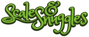
Final Logo

